Sistecrédito

Rebrandig

It is a company that specializes in the management of consumer credit for installment sales in commercial stores.


The company is in charge of studying and assigning a revolving credit quota that can be used by its clients in purchases of affiliated commercial establishments.

Client

Sistecrédito

Date

2021

Related services

Branding, Graphic design, Conceptualization, and Digital strategy.

Website

SISTECRÉDITO is a brand with more than 25 years in the market, which needs to refresh its brand identity allowing it to consolidate in Colombia as a solid brand and trajectory, and at the same time, open market in new sectors and countries in the region. Showing itself close, accessible, and with a digital approach.

To achieve this goal we had to structure the brand, organize its thoughts, and give it north and a focus in its communication.

The challenge

Solution

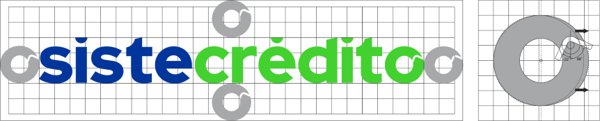
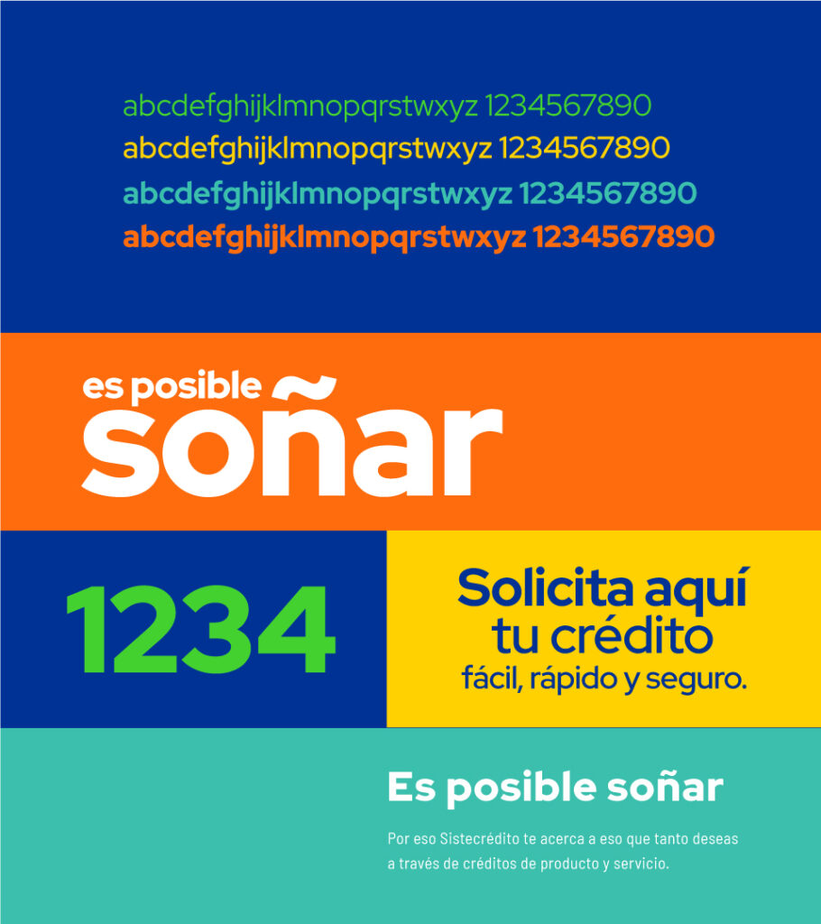
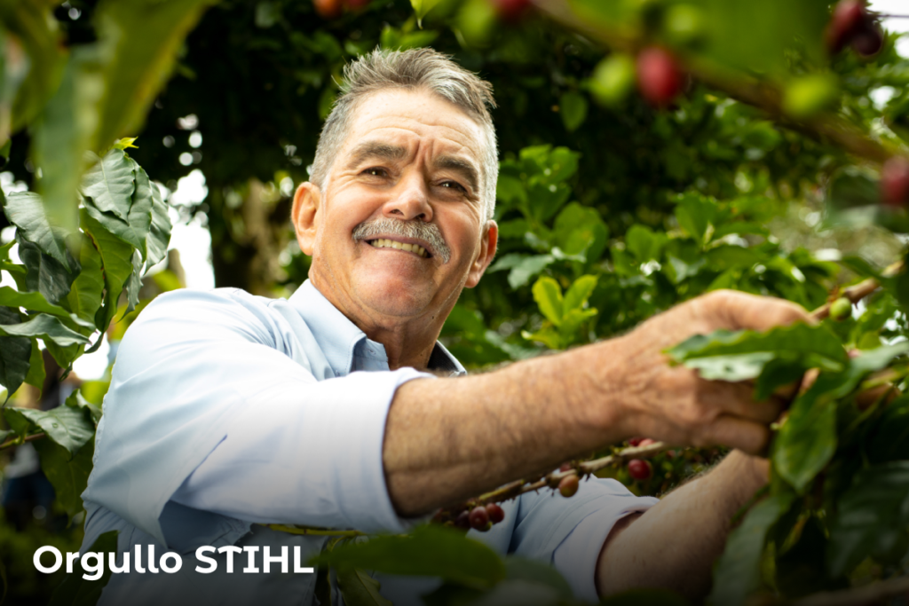
We faced this challenge as a team with the customer, thanks to their support, we understood the essence of the brand, which makes them unique, and what generates great value for all the people who come into contact with it, whether they are employees, partners or end customers. From this point, we worked on the graphic and conceptual expression, where we looked to integrate the human character of their brand philosophy with a modern, fresh, and above all authentic identity.

It is possible to change

Initially, Sistecrédito’s image was transformed, keeping the morphology of the previous isotype, seeking to preserve the essence with the eyes in the future. To generate closeness with people we chose a lowercase and rounded typography that is perfect to give the desired connection, and at the same time differentiates itself from other brands.

Color Palette

The main axis is green and blue. The secondary palette is supported by a wider range of colors that reflect the chromatic diversity of the region.

5 colors that convey joy and closeness; warmth, which is based on our culture, our message, and the possibility of achieving what we set out to do.

Typographic

The brand has the following typography, RED HAT DISPLAY, which gives it a friendly and approachable personality, in addition to giving uniqueness and homogeneity to its messages.

This typographic style was designed to be easily recognizable, allowing the creation of a brand and a written expression of easy readability either in text or figures. 

Iconography

The iconographic construction starts from an element of the brand logo, making the icon family adaptable and going hand in hand with the graphic line of the brand.

Layout

Take a step forward, stepping out of the counter to tell everyone that with your support it is possible to achieve what they want so much.